


RESOURCES / BLOG / CONTENT
How to Structure a Carousel Post: First Card, Flow, Last Card
Contents
A carousel has its own rules
According to the Instagram Help Center, a carousel can hold up to 20 photos and videos. You write one caption and one location for the whole post, and likes and comments apply to the post, not to individual cards. The format you choose (square, portrait or landscape) applies to every card; you can't mix aspect ratios. Videos inside a carousel are not treated as Reels and won't appear in the Reels tab. After publishing you can reorder or remove cards, but you can't add new ones.
Those rules shape the structure. In the feed, people see only the first card with a row of dots beneath it; the rest depends on a swipe. So the first card is a decision point, the middle cards are a reading order, and the last card is a close. Instagram's own creator tips also note that consistently sharing feed posts or carousels can help you engage your audience, which can support distribution.
The first card: a reason to swipe
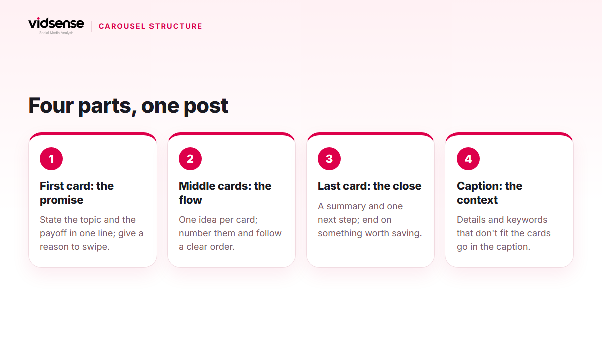
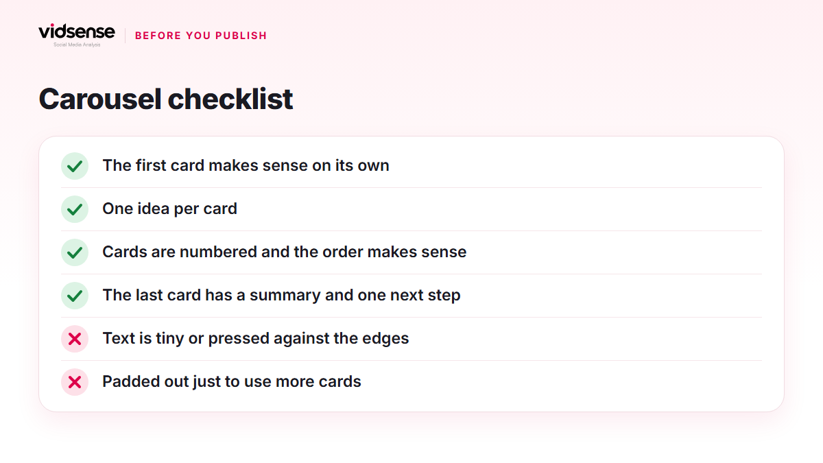
The first card is not a cover; it's a promise. Within a couple of seconds the viewer needs to understand two things: what this is about, and what they get by swiping.
Patterns that work:
- Number and outcome: a headline like "5 mistakes in the first seconds of a reel" that says what the remaining cards contain.
- A question: one line, genuinely curious, with the answer inside the cards.
- Before and after: "before" on the first card, "after" on the swipe.
What to avoid: a polished but empty cover. "New post" or a logo on its own gives no reason to swipe.
The middle cards: the flow
One card, one idea
Each card should carry a single idea. Rather than squeezing two ideas onto one card, add a card; the limit is 20, which is more than most structures need.
Order and numbering
Number the cards ("2/7") and give the order a logic: step by step, easy to hard, problem to solution. The viewer should know where they are and how much is left.
Visual consistency
Same typeface, same margins, same colour system. Keep text away from the edges and leave room for cropping on mobile. Since every card shares one format, design the images for that ratio from the start.
Rhythm
If five cards in a row are text-heavy, make the sixth visual. In a long carousel, a "mini summary" card in the middle can hold people who would otherwise drop off.
The last card: the close
The last card is the weakest card on most accounts. It has two jobs: a summary and one next step. The summary gives a concrete reason to save the post, the feeling of "all the steps on one card." The next step should be single and clear: the link in bio, a question, or an invitation such as "which one are you trying first?" Three separate asks usually means none of them gets a response.
How the caption and the cards divide the work
Cards summarise; the caption gives context. Details, sources and keywords that don't fit on the cards go in the caption. Instagram's search explainer says that for a post to be found in Search, keywords and hashtags belong in the caption, not the comments. The first line of the caption should restate the promise of the first card in different words; the two complement each other rather than compete.
How many cards?
Instagram doesn't publish a recommendation; the only official number is the cap of 20. The right count is however many the idea needs. As an example, a seven-step process wants nine cards (promise, seven steps, close), while a three-point comparison is done in five. A carousel padded out to fill the count gets abandoned in the middle.
After publishing
Post insights show views, interactions (likes, comments, saves, shares) and profile activity; there is no per-card breakdown. So compare carousels with each other: which kind of first card brought more saves, which lengths were shared more? If the first card underperformed, you still have the reorder option and can fix the same post by moving cards around.
Check it with VidSense
Carousels usually fail on the first card or the last one: the promise is vague, or there is no close. VidSense checks your post before you publish and shows the opening, the structure and any risk signals. Create a free account and run your first check from the dashboard; the free plan includes two content checks a month.
Source: carousel rules at help.instagram.com, reach tips at creators.instagram.com, how search works at about.instagram.com, and post insights at help.instagram.com.
Contents
Check your content before you post it.
Use Content Check to see potential risk signals before you publish.
Check your content →Keep reading
Content · 5 min read
Writing Instagram Captions: First Line, Structure, and CTA
The most valuable part of a caption is the first line, the one that shows before the cut-off. This guide covers how to write it, how to break up the body and where keywords belong, and how to write a single call to action, based on Instagram's official sources.
October 16, 2026
Content · 4 min read
Original Content and Reposts: Watermarks and Recommendation
Watermarked or as-is reposted content can be shown less in recommended surfaces. This guide covers originality signals and how to repost responsibly.
October 7, 2026
Content · 4 min read
Reels' First 3 Seconds: How to Write a Strong Hook
Viewers decide whether to keep watching a Reel within seconds. This guide walks through proven hook patterns and the opening mistakes to avoid.
October 1, 2026